
Buttons on React Native: Understanding the difference and which one to use
In this post, we’re going to explore the native button options available in React Native, no external libraries involved.
To demonstrate, I’ll create a new React Native project using version 0.80 with the following command:
npx @react-native-community/cli@latest init buttonsIf we take a look at the Core Components section in the official documentation, we’ll find five components that behave like buttons or respond to touch interactions:
- Button
- Pressable
- TouchableHighlight
- TouchableOpacity
- TouchableWithoutFeedback
Although they have some differences, they all provide similar button-like behavior.
TL;DR
In most cases, you should use Pressable.
It offers a more robust API, and the React Native documentation itself recommends migrating away from the legacy Touchable* components in favor of Pressable for future-proof apps.
The Button component works fine but offers very limited customization.
Code Example
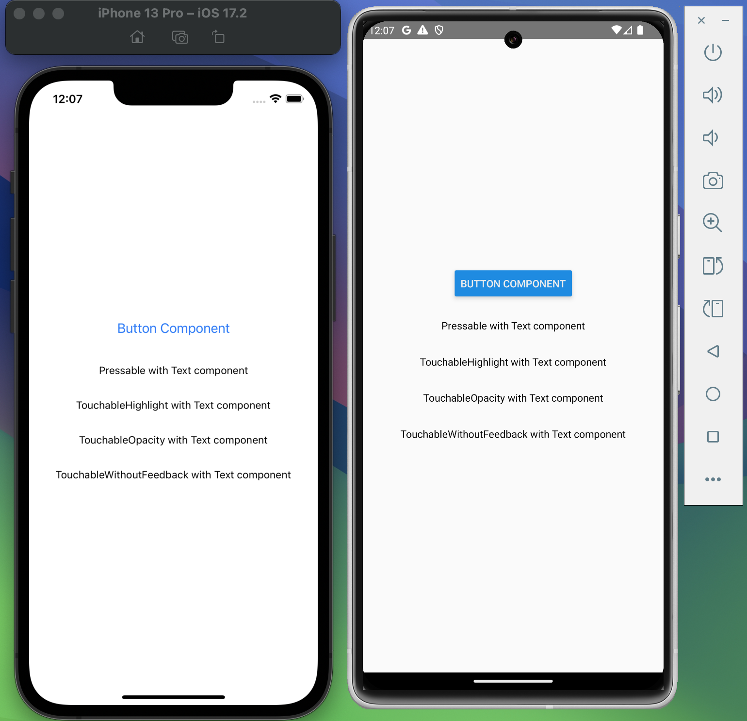
Let’s look at all five components in the same screen. The code below logs a message for each one when pressed, with no styling added. This gives us a clear look at their default behavior on iOS and Android.
import {
  StyleSheet,
  SafeAreaView,
  Button,
  Pressable,
  Text,
  TouchableHighlight,
  TouchableOpacity,
  TouchableWithoutFeedback,
} from "react-native";

function App() {
  return (
    <SafeAreaView style={styles.container}>
      <Button
        title="Button Component"
        onPress={() => {
          console.log("Button Pressed");
        }}
      />
      <Pressable
        onPress={() => {
          console.log("Pressable Pressed");
        }}
      >
        <Text>Pressable with Text component</Text>
      </Pressable>
      <TouchableHighlight
        onPress={() => {
          console.log("TouchableHighlight Pressed");
        }}
      >
        <Text>TouchableHighlight with Text component</Text>
      </TouchableHighlight>
      <TouchableOpacity
        onPress={() => {
          console.log("TouchableOpacity Pressed");
        }}
      >
        <Text>TouchableOpacity with Text component</Text>
      </TouchableOpacity>

      <TouchableWithoutFeedback
        onPress={() => {
          console.log("TouchableWithoutFeedback Pressed");
        }}
      >
        <Text>TouchableWithoutFeedback with Text component</Text>
      </TouchableWithoutFeedback>
    </SafeAreaView>
  );
}

const styles = StyleSheet.create({
  container: {
    flex: 1,
    alignItems: "center",
    justifyContent: "center",
    gap: 30,
  },
});

export default App;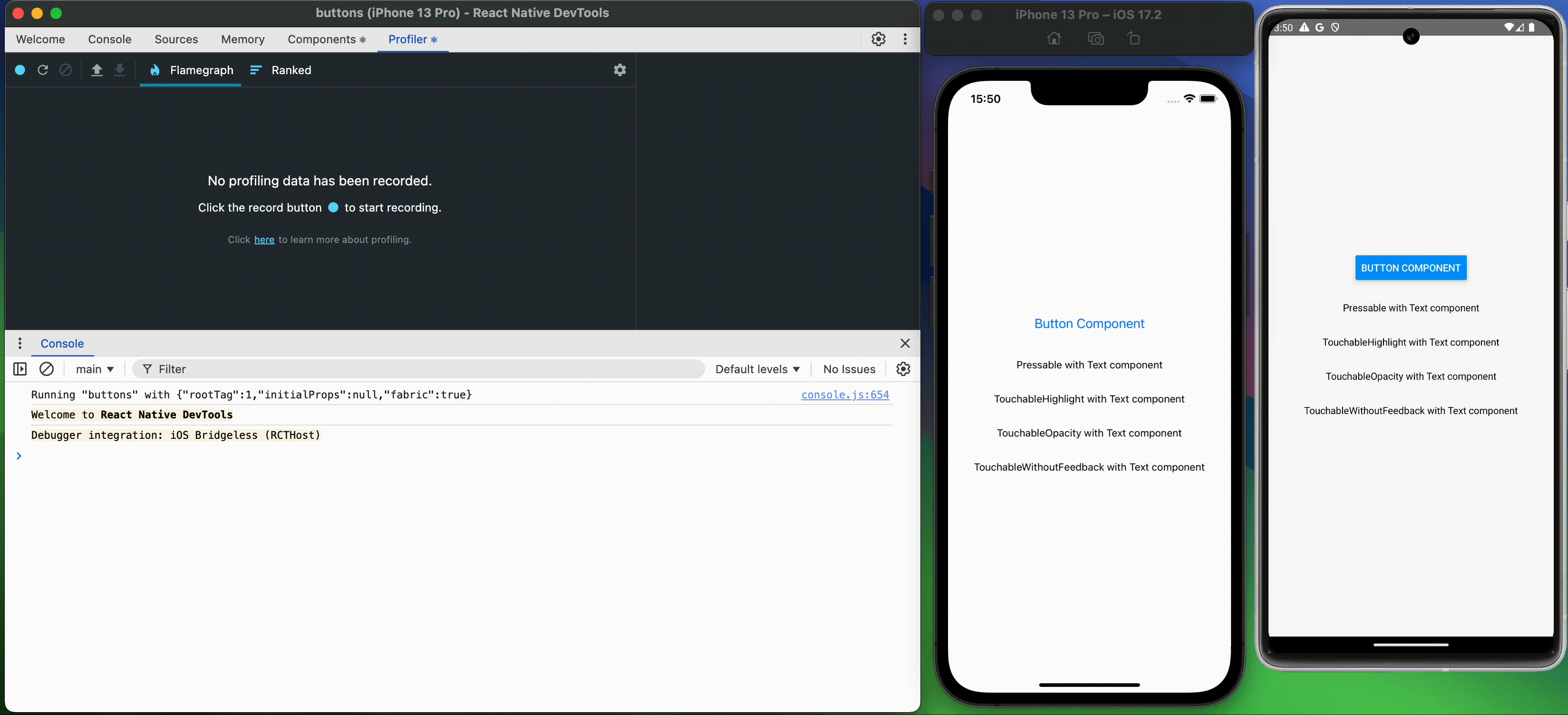
Component Overview
Button
- ✔️ Simple and easy to use
- ❌ Almost no styling options
- ✅ Good for quick tests or MVPs
TouchableOpacity
- Decreases the opacity when pressed, giving visual feedback
- Internally wraps children in an
Animated.View, which can affect layout - Good balance between simplicity and flexibility
TouchableHighlight
- Applies a colored underlay when pressed
- Requires a background color to avoid unwanted visual artifacts
- Only accepts one child. Wrap with
Viewif needed - Less common in modern UIs
TouchableWithoutFeedback
- No visual feedback
- Should not be used for buttons unless there’s a specific reason
- Common use case: dismissing the keyboard on background touch
- Only supports one child, and it clones it internally
Pressable
- Supports multiple states: pressed, hovered, focused
- Allows dynamic styling based on state
- Recommended by the React Native team as the standard touch handler
- Best option for custom UI components
- Example usage:
<Pressable
  onPress={() => {
    console.log("Pressable Pressed");
  }}
  style={({ pressed }) => [
    {
      backgroundColor: pressed ? "lightgray" : "white",
      padding: 10,
      borderRadius: 5,
    },
  ]}
>
  <Text>Pressable with Text component</Text>
</Pressable>
Conclusion
While React Native offers multiple components to handle touch interactions, not all of them are equally recommended today.
The official documentation now discourages the use of the older Touchable* components (TouchableOpacity, TouchableHighlight, TouchableWithoutFeedback) in favor of the more modern and flexible Pressable. The React Native team explicitly states that Pressable is the preferred and future-proof solution for handling touch input.
The built-in Button component, although easy to use, comes with very limited styling and behavior control. It’s useful for quick prototypes or basic apps, but falls short when you need customization or consistency across platforms.
Practical takeaways
- ✅ Use
Pressablefor most custom touch interactions. It’s the current standard and offers much more control. - ⚠️
TouchableOpacityis still functional but is considered legacy. - ❌ Avoid
TouchableHighlightandTouchableWithoutFeedbackunless you have a very specific reason. - ⛔
Buttonis fine for quick tests but not suitable for anything that needs flexibility or custom UI.
If you’re starting a new React Native project today, Pressable should be your default choice for anything that needs to respond to user interaction.
Thanks for reading until the end!